Fixing an AI-looking dashboard
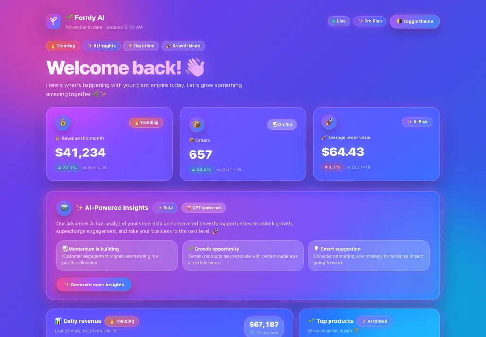
We built the most AI-looking dashboard we could (Fernly, a plant shop: purple gradients, glass cards, emoji, fake AI insights) and gave the same file to four skills that promise to make it look designed.
 SAfter
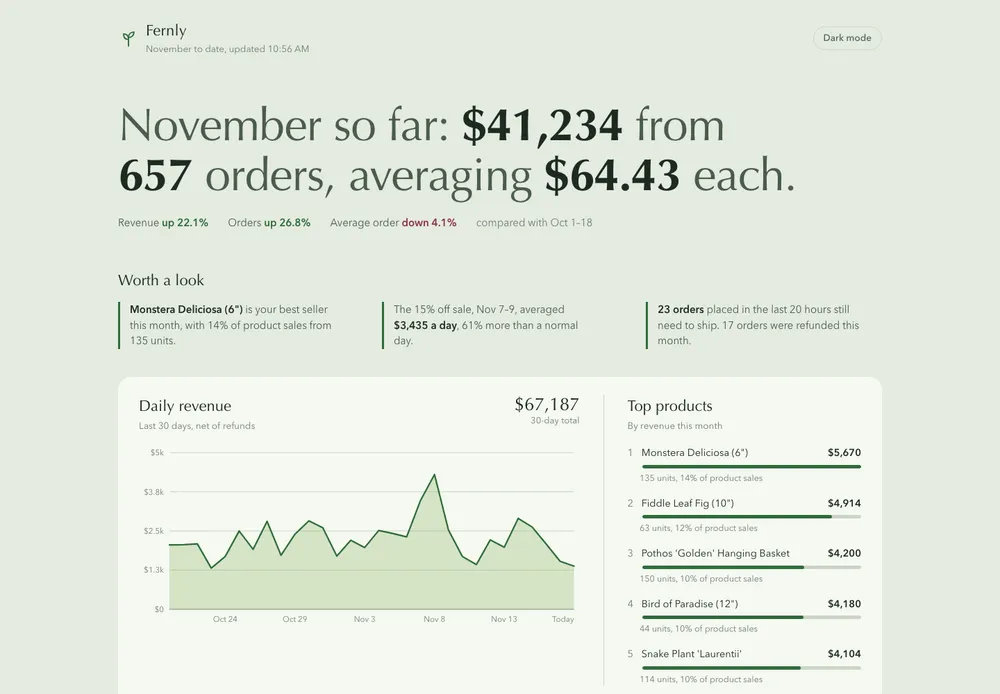
frontend-design
Anthropic
Turned the top of the page into one sentence, so you read how the month went in one line. Kept the real data and dropped every gradient.
~10 min197Knpx skills add anthropics/skills --skill frontend-design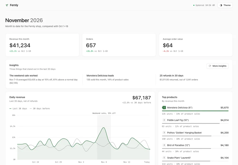 AAfter
Unslop
heydamir
The fastest by far. Stripped every gradient and emoji and turned the fake AI insights into real ones computed from the shop's data.
~4 min18Knpx skills add heydamir/unslop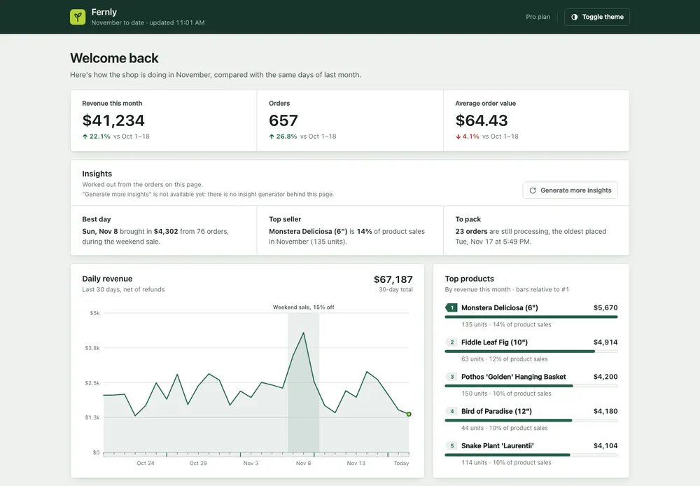 BAfter
Impeccable
pbakaus
Gave the shop its own look, a dark green bar and plant-tag labels, but kept "Welcome back" at the top and took the longest.
~17 min113Knpx skills add pbakaus/impeccable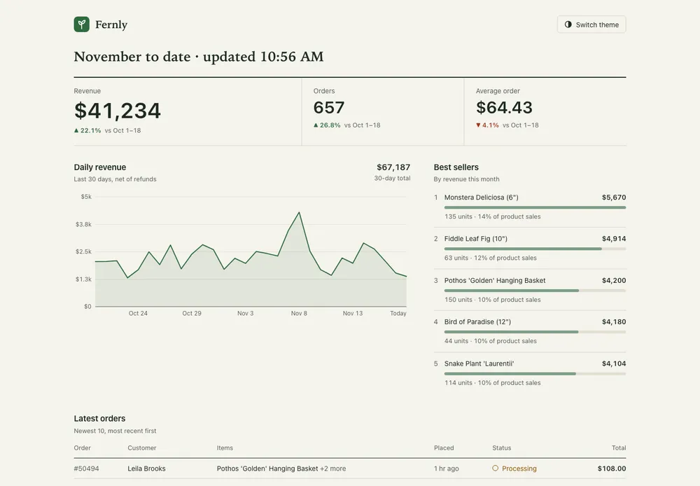 CAfter
Unslopovich
erkamyaman
Cleaned everything up but ended up looking like every other admin page, and only labelled the fake AI section a placeholder.
~9 min231npx skills add erkamyaman/unslopovich
How we tested. Claude (Opus 5.5) read each skill's SKILL.md and followed it. It did not run the skills' bundled scripts. One run per skill, ranked from the finished screenshots.
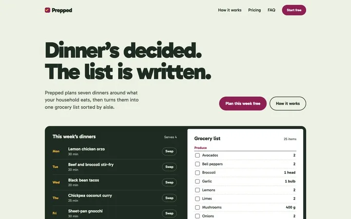
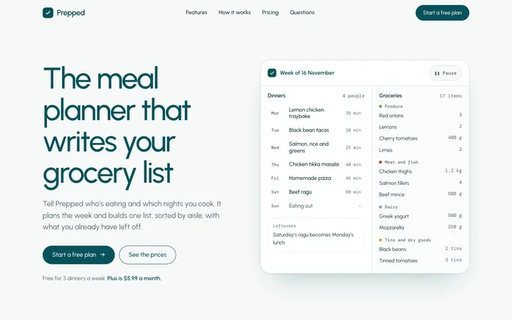
 Leonxlnx
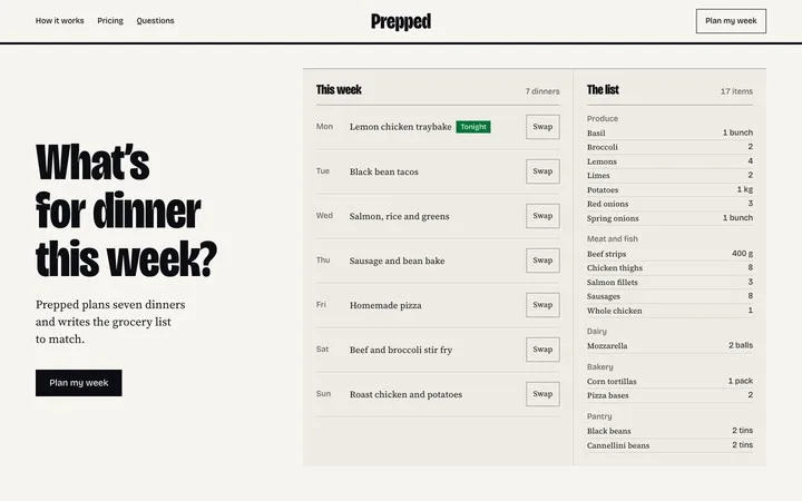
 Nutlope
 nextlevelbuilder





 multica-ai
 DietrichGebert
 cloudflare


